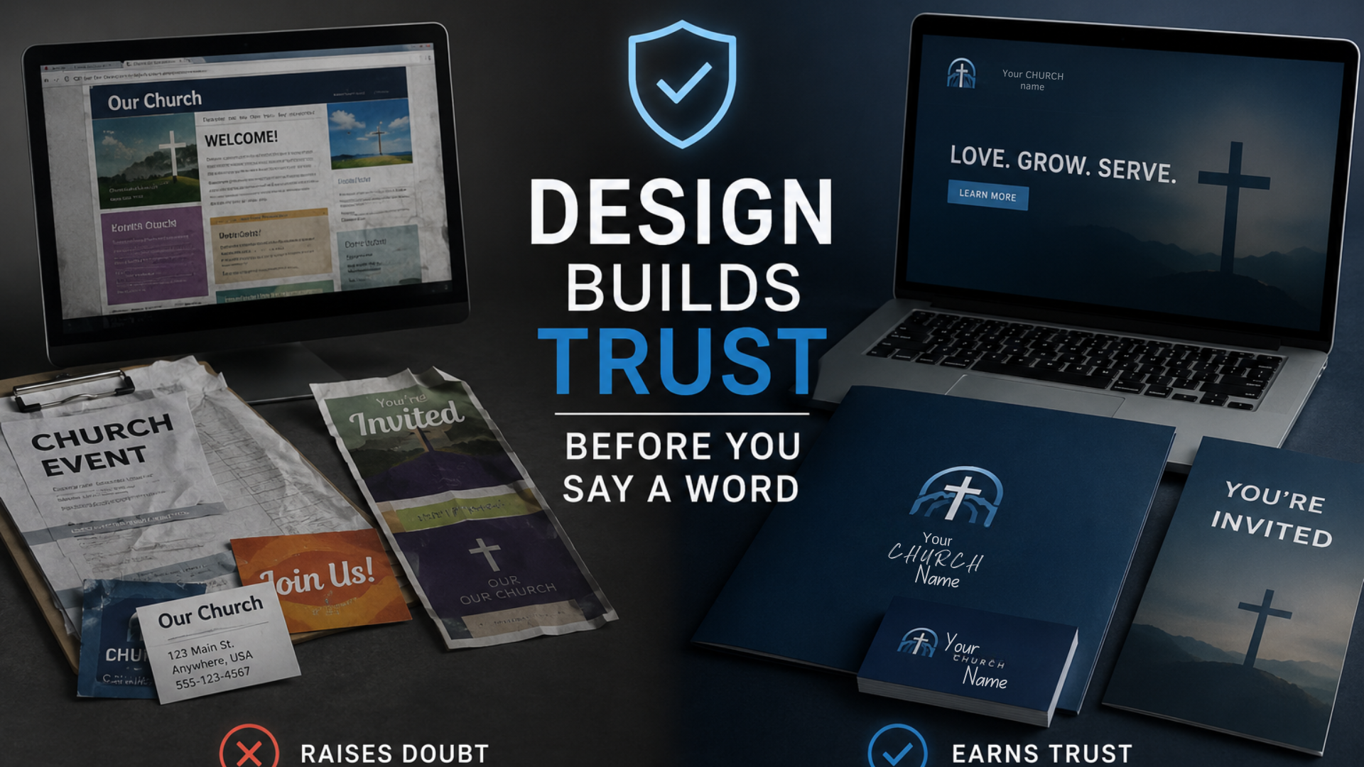
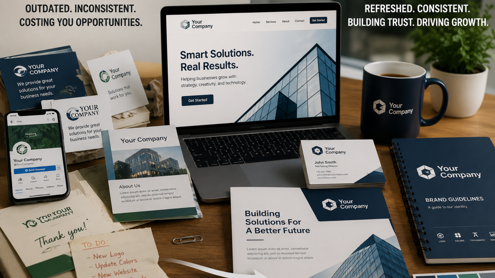
A visitor lands on your website and sees a clean, modern logo in deep blue. They click over to your Facebook page and find an older version of that same logo, slightly stretched, sitting on a mismatched background color. A week later, they walk into your building and see a banner with yet another variation, different font, different tagline, maybe even a different shade of blue entirely. None of this was intentional. Nobody sat down and decided to confuse people. It happened the way most brand drift happens: one file at a time, one well-meaning volunteer or new hire at a time, over months and years, until nothing quite matches anymore.
This is one of the most common issues we run into at No Limits Media, whether we’re working with a growing business in the Richmond area, a nonprofit juggling three social platforms, or a church running services, livestreams, and a print bulletin every single week. Individually, none of the inconsistencies feel like a big deal. A slightly different logo file here, an old color on a flyer there. But added together, they quietly erode the thing a brand is supposed to build in the first place: recognition and trust. People start to wonder, even if they couldn’t articulate why, whether they’re actually in the right place.
Over the past three weeks, we’ve talked about what a brand really is beyond a logo, the signs that yours might need a refresh, and how strong design builds trust before a single word is read. This final week is where it all comes together. Because none of that matters much if your brand looks and sounds like three or four different organizations depending on where someone happens to find you. Consistency is what turns good design into a system — and a system is what actually protects your reputation over time.
Start With One Page Brand Guide (Not a 40 Page Manual)
When people hear “brand guidelines,” they often picture a massive PDF full of legal-sounding rules that nobody will ever open. That’s part of why so many small businesses, churches, and nonprofits skip this step entirely. But a brand guide doesn’t need to be complicated to be effective. In most cases, a single page does the job.
A useful one-page guide covers the essentials: your logo and its acceptable variations (including a version for dark backgrounds), your exact brand colors with hex codes, your header and body fonts, and two or three lines about your tone of voice are you warm and conversational, or precise and authoritative? That’s it. The goal isn’t to create a rulebook that stifles creativity. It’s to give anyone who touches your brand, from a new marketing hire to a volunteer designing next month’s event flyer, a fast reference point instead of a guessing game.
We’ve seen organizations put off building this document because it feels like a “someday” project. In practice, it’s one of the highest-leverage things a business or ministry can create, because every piece of content produced afterward becomes faster to make and more consistent by default. It removes the back-and-forth of “what blue do we use again?” and replaces it with a quick glance at a page everyone already has access to.
Centralize Your Assets So Nobody’s Guessing
Even the best brand guide won’t help if your logo file lives in seventeen different places, half of them outdated, scattered across old email threads, someone’s personal laptop, and a folder nobody remembers the name of. This is one of the quiet culprits behind brand inconsistency: not a lack of standards, but a lack of access to the right files.
The fix is straightforward, even if it takes a little upfront effort: one shared, organized folder (Google Drive, Dropbox, SharePoint, whatever your organization already uses) that holds your current logo files in every format someone might need PNG with a transparent background, a version for print, a simplified icon for social media profile photos along with your brand guide, approved color swatches, and font files. Label things clearly. Archive the outdated versions somewhere separate so there’s no confusion about which file is current.
For churches especially, where staff changeover and volunteer turnover are common, this single step prevents a huge amount of drift. A new volunteer designing the Sunday bulletin shouldn’t have to ask five people where to find the “real” logo. It should just be sitting in an obvious folder labeled “Current Brand Assets,” ready to use the first time correctly.
Quick Tip
Create a folder called “Brand Assets Current” and put a note at the top of it listing the date it was last updated. Anytime you update your logo or colors, replace the files in that same folder rather than creating a new one. One home for your brand assets means one less way for old versions to resurface.
Audit Every Touchpoint on a Regular Schedule
Brand inconsistency rarely announces itself. It creeps in gradually, which is exactly why a one-time cleanup isn’t enough. The organizations that stay consistent over the long run treat brand audits the way they treat any other regular maintenance: something scheduled, not something that only happens when someone finally notices a problem.
A brand audit doesn’t need to be a massive undertaking. Once or twice a year, walk through every place your brand shows up: your website, your social media profiles and cover images, your email signature, your printed materials, your signage, your vehicle wraps if you have them, your video intros and lower thirds. For each one, ask a simple question does this match what’s in the current brand guide? If the answer is no, note it, prioritize it, and fix it on a reasonable timeline rather than letting it linger.
This matters more than it might seem for organizations with multiple locations, multiple staff members creating content, or multiple platforms to manage. A business with two office locations might find the reception area signage was never updated after a rebrand two years ago. A nonprofit might discover its Instagram bio still references an old tagline. A church might realize the printed connection cards in the pews use a font nobody uses anywhere else anymore. None of these are dramatic failures. They’re just the natural result of time passing without anyone checking. A scheduled audit catches them before a visitor does.
Train Staff and Volunteers on the Brand Standards
A brand guide sitting unused in a shared folder doesn’t protect consistency by itself. People have to actually know it exists, understand why it matters, and feel confident using it. This is especially true for organizations that rely on volunteers, part-time staff, or a rotating cast of people creating content a reality for almost every church and many nonprofits.
Training doesn’t need to be formal or time-consuming. A fifteen-minute walkthrough during onboarding, a quick reference shared in a team Slack or group text, or a short explanation the first time someone asks to design a flyer can go a long way. The goal is to make following the brand standards the easy path, not an extra hurdle. If pulling the correct logo and colors takes thirty seconds because everything is organized and explained clearly, people will use it. If it takes twenty minutes of searching and guessing, they’ll improvise, and improvisation is where inconsistency starts.
It also helps to explain the “why” behind the guidelines, not just the “what.” When a volunteer understands that using the same blue everywhere helps people recognize the church’s communications at a glance, they’re more likely to care about getting it right, rather than seeing the rules as arbitrary restrictions on their creativity.
Keep Print and Digital Moving in the Same Direction
One of the more overlooked consistency gaps happens between print and digital. It’s easy to keep a website current, since updates take minutes. Print materials are a different story: a brochure, a banner, a set of business cards, or a yard sign can stay in circulation for years after a logo update or color refresh, quietly working against everything else you’re doing online.
The goal isn’t to reprint everything the moment something changes. That’s rarely practical or necessary. The goal is awareness: knowing what print materials exist, understanding their lifespan, and building updates into your normal reprint cycle instead of letting old versions circulate indefinitely. When a business updates its logo, that update should flow into the next batch of business cards, the next round of signage, the next print run of brochures, not stay isolated to the website while everything printed stays frozen in an earlier era of the brand.
This is where having a design and print partner who understands your full brand system pays off. Instead of treating each printed piece as a one-off request, it gets produced against the same guide, the same color values, and the same fonts as everything digital. The trade show banner matches the website. The church bulletin matches the livestream graphics. The vehicle wrap matches the business card. Nothing feels like it belongs to a different organization.
BY THE NUMBERS
Businesses that present their brand consistently across every platform are widely reported to see meaningfully stronger customer recognition and trust compared to those with inconsistent visuals, with some industry research suggesting consistent branding can lift revenue by as much as 10 to 20 percent. Consistency isn’t a cosmetic detail. It’s a measurable business advantage.
The Bottom Line
Across this month, we’ve walked through what a brand actually is beyond a logo, the signs that yours might be due for a refresh, why strong design builds trust before you say a single word, and now, how to keep that brand consistent everywhere it shows up. Each piece builds on the last. A brand is a system. That system sometimes needs updating. Good design makes it work. Consistency protects that effort over time, across every website page, social post, printed piece, email, and sign that carries your name.
None of this requires a massive budget or an overnight overhaul. It requires a clear one-page guide, a centralized set of assets, a regular audit habit, a little training for the people creating content, and a plan to keep print and digital moving together instead of drifting apart. This is exactly the kind of work our graphic design, branding, and marketing materials team helps businesses, churches, and nonprofits handle every day, building the systems that keep a brand looking and feeling like one organization, no matter where someone encounters it first.
TAKE THE NEXT STEP
Ready to bring every touchpoint of your brand into alignment? Visit nolimitsmedia.com to schedule a free brand consistency assessment and see exactly where your brand is strong, where it’s drifting, and what a simple, sustainable system could look like for your organization.