A visitor lands on your website, or picks up a flyer from a table at a community event, or shakes hands with someone who just handed them a business card. In that first second or two, nothing has been read yet. No mission statement, no service list, no “About Us” page. And yet a judgment has already formed: professional or amateur, established or struggling, trustworthy or questionable.
That judgment isn’t fair, exactly. It’s also not optional. Every brain does this, constantly, because sorting the world into “safe to engage with” and “proceed with caution” is a survival instinct that never got the memo that we’re now applying it to church bulletins and nonprofit brochures instead of predators in tall grass. Design is the language that instinct reads first, and it reads it faster than any of us would like to admit.
We spent the first two weeks of this series talking about why a brand needs to function as one connected system, and how to spot the warning signs that yours has drifted out of alignment. This week, we’re zooming into a single, specific piece of that system: the visual first impression, and why it carries more weight than most organizations realize. Because long before someone reads your copy, they’ve already decided how much they trust you. Design made that decision for you.
The Judgement Happens Faster Than You Think
Researchers who study first impressions have found that people form an opinion about a website’s credibility in well under a second, often before they’ve consciously registered a single word on the page. That number tends to surprise people, because it feels too fast to be meaningful. But think about how you actually browse. You don’t read a site top to bottom before deciding whether to stay. You glance, and something in the layout, spacing, and color either invites you in or nudges you toward the back button.
The same thing happens with printed materials, just on a slightly longer timeline. A donor pulls a mailer out of an envelope. A prospective member picks up a bulletin at the welcome table. A homeowner glances at a folded brochure a contractor left on their door. In each case, the recipient decides whether the piece is worth their attention before they’ve read the headline. A crowded layout, mismatched fonts, or a blurry logo signals “low effort” instantly, and low effort gets filed away as “low reliability,” fairly or not.
This is uncomfortable for a lot of organizations because it means the design is doing persuasive work whether you intended it to or not. A church with a wonderful, welcoming congregation can still come across as disorganized if its handouts look thrown together. A contractor with twenty years of flawless work can lose a bid to a competitor with a sharper logo, simply because the logo arrived first and the reputation hadn’t caught up yet.
Typography and Layout Do the Talking Before the Words Do
Typography is one of those things almost nobody consciously notices when it’s done right, and almost everybody notices when it’s done wrong. Three mismatched fonts on one flyer, text crammed edge to edge with no breathing room, a paragraph set in a script font that’s lovely for a wedding invitation and unreadable for a program bulletin: none of these are catastrophic on their own, but together they create a low hum of friction. The reader has to work harder to extract the information, and that extra effort gets subconsciously blamed on the organization, not the font choice.
Clean typography does the opposite. Consistent font pairings, generous white space, and a clear visual hierarchy (what’s the headline, what’s the subhead, what’s supporting detail) let a reader’s eyes move through a page the way water moves through a well-designed channel: smoothly, with no unexpected obstacles. That smoothness reads as competence. It tells the reader, without a single word confirming it, that the people behind this document know what they’re doing.
Layout carries the same weight at a larger scale. A website with a cluttered homepage, five competing calls to action, and a navigation menu that takes three clicks to find the “Contact” page communicates disorganization structurally, regardless of how good the actual writing is. A well-organized layout, by contrast, feels like a host who has already thought through what a guest will need and set the table accordingly. Visitors relax. They stay longer. They’re more willing to fill out a form or make a call, because the experience up to that point has felt handled.
Color and Consistency Signal Whether You’re the Real Deal
Color is doing more strategic work than most people give it credit for. A single, deliberately chosen palette used consistently across a website, a set of print materials, and a social media page tells a visitor that this organization has its act together well beyond just marketing. It suggests the same care extends to how phone calls are answered, how projects are managed, and how promises are kept.
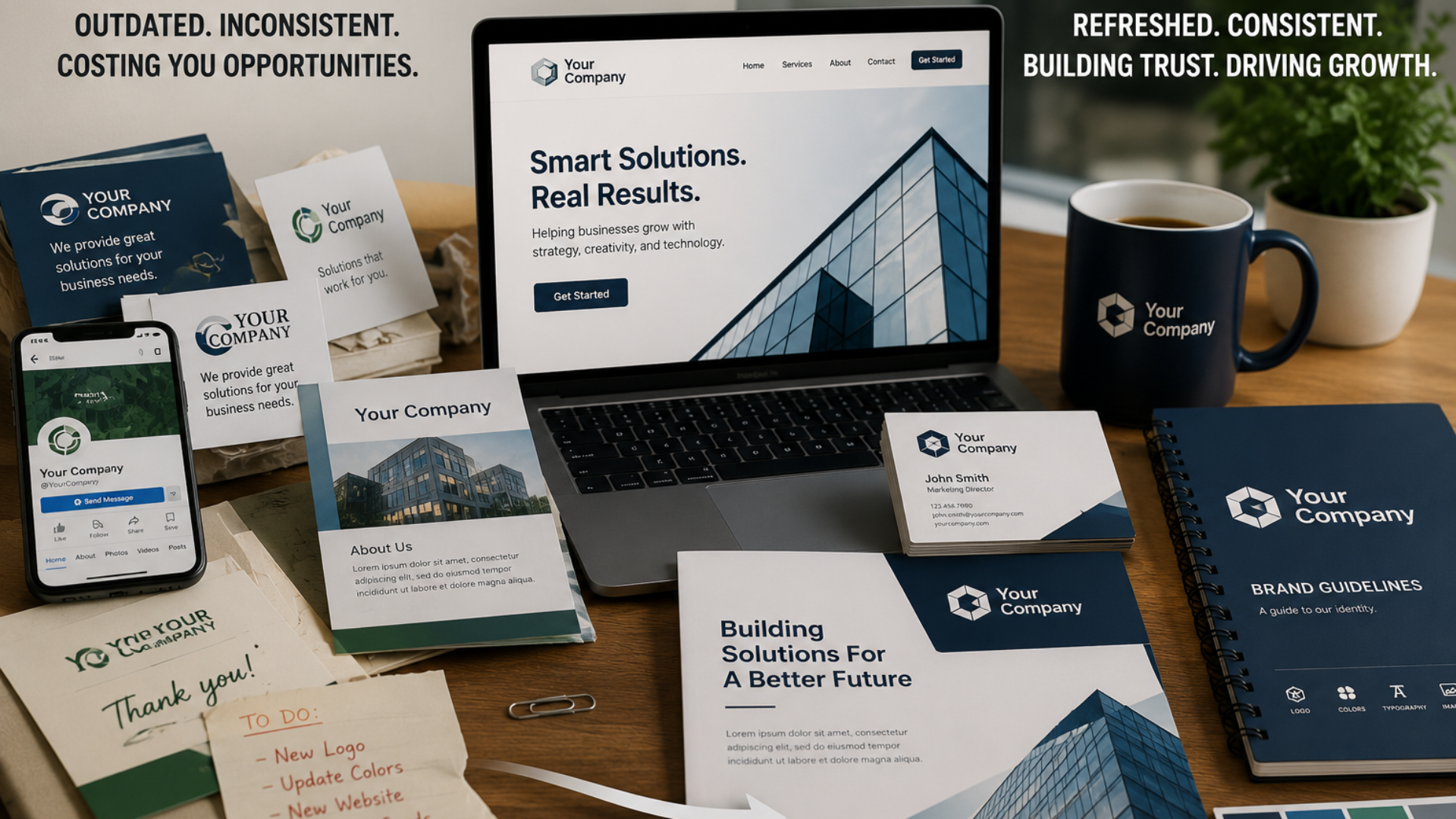
Inconsistent color, on the other hand, raises quiet, unspoken questions. If the website is one shade of blue, the letterhead is a completely different blue, and the social media graphics use a palette that doesn’t match either, a visitor who encounters more than one of these touchpoints starts to wonder whether they’re actually dealing with the same organization, or whether things have simply been assembled piecemeal over the years by whoever happened to be available at the time. Neither wondering nor questioning is good for trust.
There’s also a psychological dimension specific to color choice itself. Cooler tones like blues tend to read as stable, professional, and calm, which is part of why so many technology, financial, and healthcare brands lean on them. Warmer accent tones, used sparingly, draw the eye to what matters most, whether that’s a giving button, a “Schedule a Consultation” link, or a call-out on a printed program. None of this requires an organization to become a design theory expert. It does require choosing a palette on purpose and sticking with it everywhere the brand shows up.
Print Quality Still Matters, Even in a Digital World
It’s tempting to assume that because so much of modern marketing lives on screens, print materials matter less than they used to. In practice, the opposite is often true. Because most people encounter fewer physical business cards, flyers, and brochures than they did a decade ago, the ones that do land in someone’s hands get noticed more, not less. A flimsy card that bends the moment it goes into a wallet, a flyer printed on paper so thin the text on the back bleeds through, or a brochure with visibly pixelated photos: these physical, tactile cues are processed almost instantly, and they’re hard to unnotice once seen.
Weight of paper stock, quality of the print job, sharpness of images, and even the finish (matte versus glossy, for instance) all contribute to a sense of substance. A nonprofit handing out a donor appeal letter on heavy, well-printed stock is communicating, wordlessly, that the organization takes stewardship seriously, right down to the printing budget. A church handing new visitors a smudged photocopy of a welcome packet is communicating something too, even if it’s the opposite of what anyone intended.
This matters just as much for small businesses. A contractor’s estimate printed on a crisp, branded template feels more trustworthy than the same numbers scrawled on a generic invoice pad, even if the pricing and the workmanship are identical. Print materials are one of the few remaining places where a brand can be felt, not just seen, and that tactile impression sticks with people longer than most digital ones do.
Digital Consistency Closes the Loop
None of this stays contained to one channel. Someone who receives a beautifully printed brochure and then visits a website that looks like it was built by a different organization entirely experiences a small but real jolt of doubt. Someone who follows a polished social media page and then opens an email newsletter with a completely different logo treatment feels that same friction, even if they couldn’t name exactly what felt off.
Consistency across every touchpoint, print and digital alike, is what allows a first impression to compound into lasting trust rather than eroding on the second or third encounter. A visitor who sees the same fonts, the same colors, the same tone of voice on the website, in the email inbox, on social media, and in a printed program has every reason to believe the organization behind all of it is stable, intentional, and paying attention. That belief, formed well before any real interaction takes place, is often what determines whether someone reaches out at all.
QUICK TIP
Quick Design Self-Check: Pull up your website next to your most recent printed material (flyer, bulletin, brochure, or business card) and ask three questions. Do the fonts and colors clearly belong to the same organization? Can a stranger tell what to do next within five seconds of looking at either one? Would you personally trust this organization based on appearance alone, with no other context? If you hesitate on any of the three, that’s a design gap worth closing.
BY THE NUMBERS
People form a judgment about whether to trust a website in a fraction of a second, well before they read any of the actual content, and that snap reaction is driven almost entirely by visual design cues like layout, color, and typography. The same instinct applies to printed materials: a cluttered flyer or a low-quality print job can undo the credibility of an otherwise excellent product or service before a single word is read.
The Bottom Line
Design isn’t decoration sitting on top of your message. It’s the first sentence of your message, read before your actual first sentence ever gets a chance. A clean, consistent, well-produced brand, across a logo, a website, a brochure, and a business card, tells a customer, church member, or donor that this organization pays attention to details, keeps its promises, and takes the relationship seriously. A messy or inconsistent one raises doubts that no amount of great service can fully undo, simply because those doubts formed before the service was ever experienced.
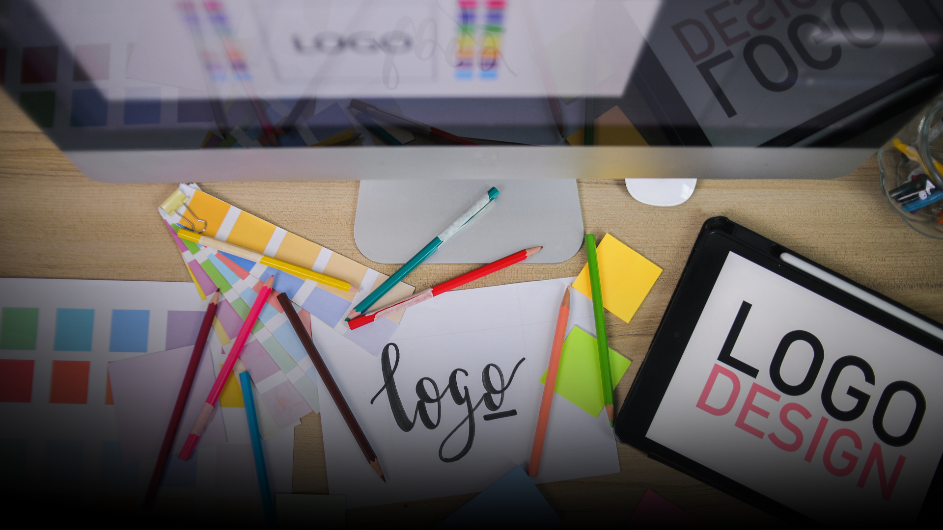
This is exactly where No Limits Media’s Graphic Design, Branding, and Print Design services come in. We help businesses, churches, and nonprofits build a visual identity, logo, marketing materials, and print collateral that all work together, so that every first impression, digital or physical, earns trust instead of quietly spending it down. If your materials haven’t been looked at together as a whole in a while, that’s usually the first sign it’s time.
TAKE THE NEXT STEP
Not sure what your current materials are silently communicating? No Limits Media offers a free brand assessment to show you exactly where your design is building trust and where it might be costing you. Visit nolimitsmedia.com to get started.