If your website were a real front door, what would it look like to a first-time visitor?
Would it look open, lit, and welcoming? Or boarded up, dated, and a little confusing?
For most small businesses and churches, the website is exactly that — the actual front door of the organization. It’s the first thing visitors see, the first place they form an opinion, and the single most important place where ‘should I engage with these people?’
gets decided.
The most uncomfortable truth about that decision: it doesn’t take five minutes. It doesn’t take five seconds. It takes about 50 milliseconds — five hundredths of a second.
The 0.05-Second Rule
Researchers at Google have studied how visitors form first impressions of websites. Their finding: it takes just 50 milliseconds for a visitor to decide whether they like or trust a site.
That decision happens before they read a single word. Before they see a service. Before they understand what your organization does. They take in the colors, the layout, the modern (or dated) feel, the spacing — and they make a snap judgment about whether this looks like a place worth spending more time.
Once that judgment is made, every other piece of information visitors encounter — your services, your sermons, your testimonials — gets filtered through it. A website that ‘looks dated’ makes excellent content feel less credible. A website that ‘looks professional’ makes simple content feel more authoritative.
The good news: this is an opportunity. The bad news: most small business and church websites are squandering it.
Why Your Website Is Your Digital Front Door
There’s a reason we use this metaphor. Think about how you treat the front door of a real building.
If you own a shop, you sweep the entrance every morning. You make sure the lighting works. You check the sign for damage.
You re-paint when it gets weathered. You replace the welcome mat when it gets worn.
If you pastor a church, you walk through the doors every Sunday. You make sure the welcome team is greeting visitors. You re-stripe the parking lot when it fades. You make sure the building looks alive and cared-for.
Now ask: when was the last time you treated your website with that level of care?
For most organizations, the answer is ‘years ago’ — usually when the site was first launched. After that, it became invisible. Visitors keep showing up to the digital front door, and the door keeps gradually weathering. Eventually, it looks closed.
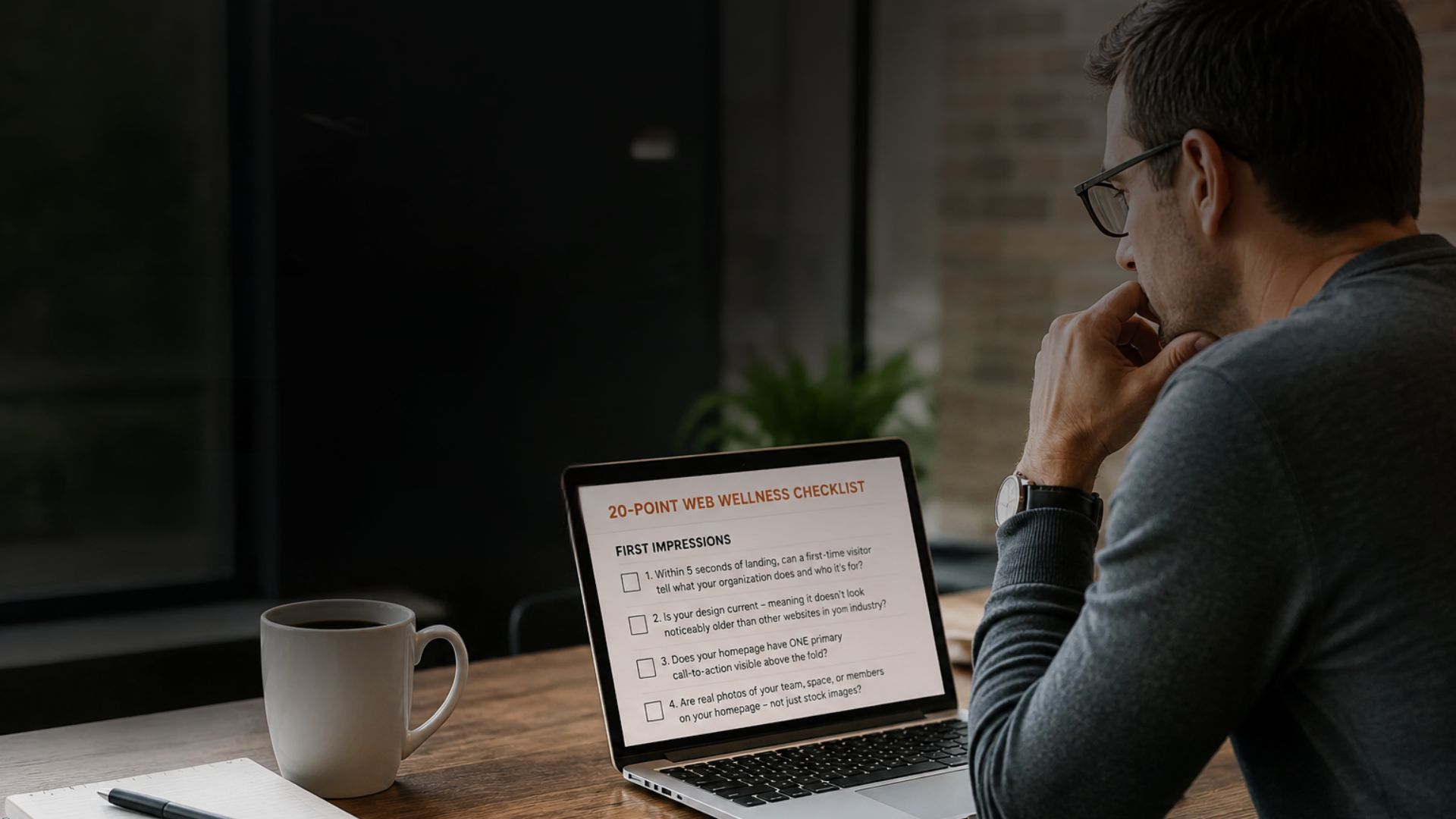
The 7 Signs Your Digital Front Door Needs Attention
Run through these seven questions about your own website. Each ‘yes’ is a quiet visitor leak:
1. The design looks dated when you compare it to current websites in your industry
2. It loads slowly on a phone (over 3 seconds)
3. Important information (services, service times, phone, address) isn’t visible without scrolling
4. There’s no clear next step on the homepage
5. Photos are obvious stock images instead of real photos of your team or space
6. There’s a typo, broken link, or outdated date somewhere on the homepage
7. You haven’t asked a real first-time visitor for honest feedback in over a year
If any of these are true, your website is quietly costing you visitors. Not because anyone is upset — because they’re simply leaving and going somewhere else without telling you.
What Visitors Actually Look For (And What They Decide)
When a first-time visitor lands on your website, they’re trying to answer four questions in under 5 seconds:
1. What does this organization do?
2. Is it for me?
3. Can I trust them?
4. What’s the next step?
If your homepage answers all four, your visitor stays and engages. If it answers three, they’re curious but uncertain. If it answers fewer than three, they’re already gone.
Most homepages — even well-designed ones — bury one or more of these answers. A vague ‘Welcome’ headline. A giant photo carousel that takes 8 seconds to load. A menu with 12 options instead of a single obvious ‘Book’ or ‘Plan Your Visit’ button.
Each of these turns a ‘yes’ into a ‘maybe,’ and a ‘maybe’ into a closed tab.
The Fix Is Smaller Than You Think
Here’s what most owners and pastors don’t realize: fixing your digital front door usually doesn’t require a full rebuild.
Most of the heaviest lifts are surprisingly small:
• Replace the homepage hero with a clear headline answering ‘what we do, who it’s for’
• Add ONE primary call-to-action button above the fold (Book, Plan Your Visit, Get a Quote, Give)
• Compress your images so the page loads in under 3 seconds
• Add real photos of your team, space, or members where stock photos used to be
• Make sure your phone number, address, and service times are visible immediately
• Update anything that says ‘Spring 2024’ or older
Six fixes. None of them require a redesign. All of them noticeably move the needle in 30 days.
The Bottom Line
Your website is your front door. Visitors decide whether to knock in 0.05 seconds — and they decide based on signals you can absolutely control.
The organizations whose websites quietly grow them every month aren’t necessarily the ones with the biggest budgets. They’re the ones who treat their digital front door with the same care they’d give their physical one.
If your front door has been weathering for a few years, this month is a great time to refresh it.
──────────────────────────────
No Limits Media designs and refreshes websites for churches and small businesses across the mid-Atlantic. We start with a free 30-minute Web Design Assessment — no obligation, just clarity on what’s working, what isn’t, and what’s worth fixing first